Replies sorted oldest to newest
Minecraft deer.
Really, how can they **** this up over and over again?
bring back the old color scheme


and haircuts

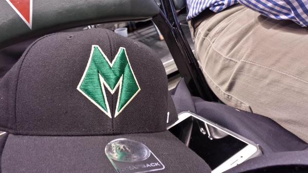
Like the colors but hate the super hero "M"

It's not just a random selection of colors that went well together, either. There is a reason behind the decision, which the Bucks also released at halftime. From the press release:
Green
· The traditional color of the Milwaukee Bucks - a hallmark of our brand throughout the team's 47-year history.
· Emblematic of the state's dense forests and rich agricultural industry.
Cream
· Just as the "Cream City" brick is the foundation upon which Milwaukee was built, cream will be the foundational color of the team's new brand identity.
· Cream will be unique to the Bucks - we'll be the only team in NBA to feature a cream hue as an official team color.
Blue
· Blue underlines the importance of the Great Lakes and multiple rivers in the history and future of our city and state. In fact, some think the word Milwaukee was derived from the Algonquian term "Millioki," which meant "gathering place by the waters."
· The addition of blue to our color palette pays homage to the history of professional basketball in Milwaukee, as blue was the primary color of the Milwaukee Hawks, the city's first NBA team.
that "M" is horrible
Agree EKB. Considering the press release on the color I'd expect a more traditional graphic for the M. That M seems futuristic, something a 15 year old would doodle, yet their reasoning on the colors pays homage to the tradition of the region.
Guessing what we see on Apr 13th will be better - **** I hope so.
The "M" is ok when combined in the neck of the BUCK, but alone it is nasty.

A lot of premature #$!* going on.
Oh yeah, only an old guy would pine for that old logo. If they want anyone under 30 to wear their unis they better stay as far away as possible from that lame logo.
EVOLVE, PEOPLE! ![]()
It is bad ass.
wow. Love it.
Always wanted the Bucks to go back to a Green and Beige color scheme.
The Red and Purple additions were terrible IMO. This on e looks more classic
might have to grab me some deer gear!
Those stripes on the side are reminiscent to the jersey around the time Moncrief played. Like it!
I really like almost everything about the rebrand. Like the primary logo a ton, like the uniforms a ton.
Here's a story about the process of the rebrand, which might only be interesting to a Marketing/Branding professional like myself, but I think does a good job explaining some of the reasoning and thoughts behind it.
Also liked the tertiary logo, reminds me a bit of the diagonal of the Badgers hockey uniforms...

Floor details released today, again with an article about the choices they did/didn't make make which I found pretty great, but I'm a branding guy so...
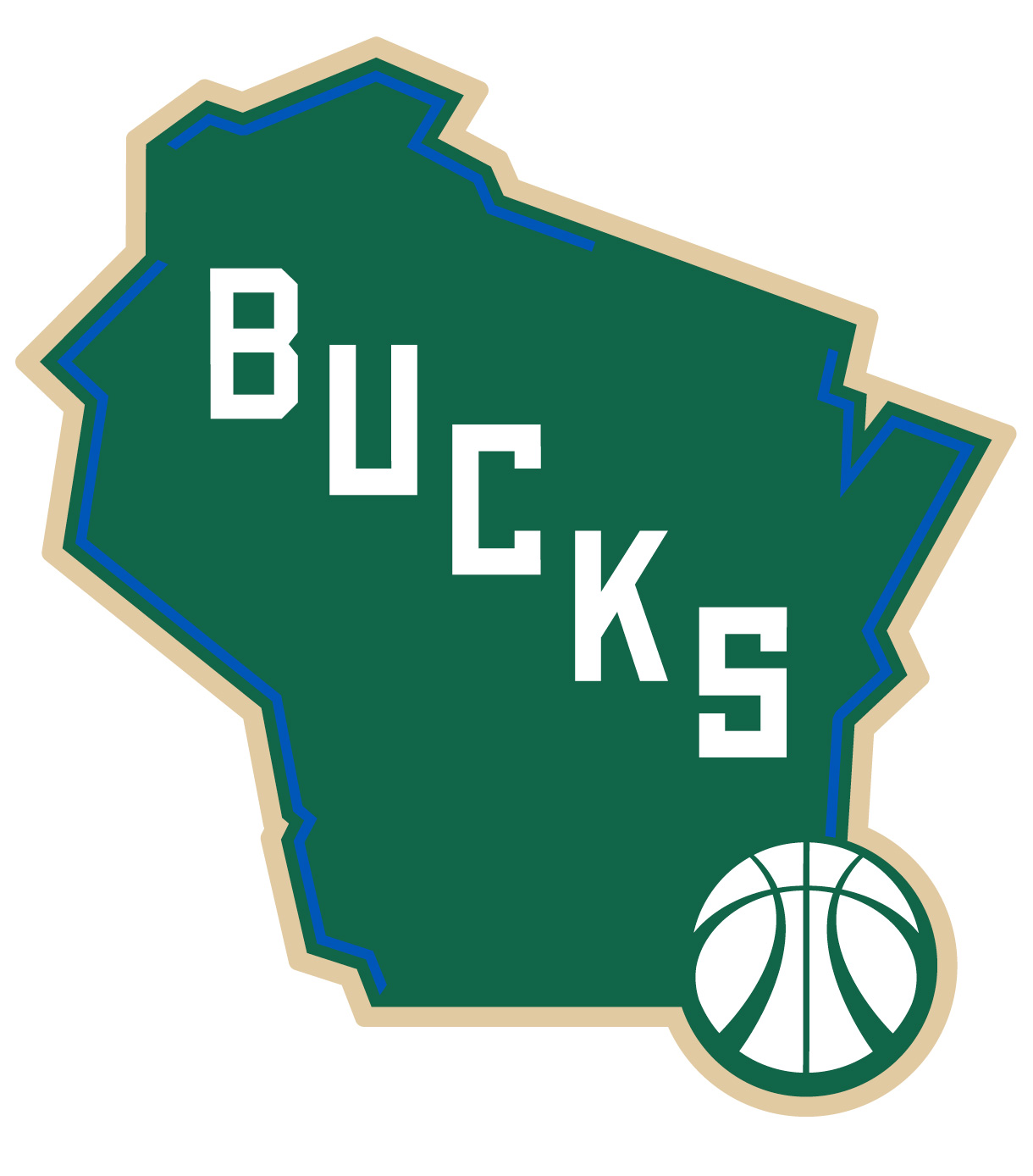
As foreshadowed in the article, I do think the state logo at center court would look great.

Those are awesome. For the first time ever I want an nba jersey.