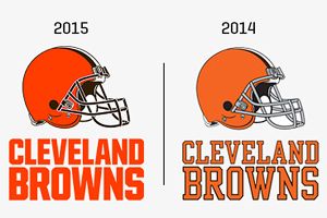
Our updated helmet logo is reflective of today’s modern Cleveland – the design honors the past while evolving into the future. The iconic brown and white stripes stand tall over the orange helmet – a new orange color that matches the passion of the Dawg Pound. The new brown facemask represents the strength and toughness of Cleveland.....
This is why Cleveland sucks at anything in the history of everything.