No, No, No. Please don't ever mess with a classic.
Even though I wouldn't change the current helmet EVER, the Green Bay Packers one looks cool. Would you wanna see this for maybe one game? ~mw

No, No, No. Please don't ever mess with a classic.
Even though I wouldn't change the current helmet EVER, the Green Bay Packers one looks cool. Would you wanna see this for maybe one game? ~mw

Replies sorted oldest to newest
looks cool if you're starting a new NFL team in Greenwood, Mississippi.
the GBP already have a helmet design that has stood the test of time.
no thank you.
No
I did like the ones they wore a few years ago with the stripe removed.
I think it was on Thanksgiving?
the only one I liked was the Dolphins, and actually like it quite a bit.
and bringing up the rear once again - that queens helmet. but what can you do to make a turd pretty?
I don't personally mind that look for a game here and there, I just think more yellow/gold needs to be included. Maybe a green jersey, white pants with yellow/gold trim?
Logo takes up almost half the helmet and is way too big.
Didn't NFL say there would be a "new" alternate jersey for Halloween week in 15? I wouldn't mind a new design just for that. I saw a nice one somewhere on the line, will look for it.
They really need to work on the technology of the helmets impact properties. Maybe then they could go back to playing tackle football.
Ugly and pandering to a younger generation. Yuck. We're the Green-n-Gold!
Oversized graphics are so like 2000.


^the 85 is interesting
like the tan pants
yes, this is the offseason...
Let's rename the team the Edisons and have the helmet be a glowing light bulb. I don't mean a logo of a light bulb on the side of the helmet. I mean the helmet would be a glowing light bulb.
Yeah, I can picture Ted Thompson signing off on this.
Circle jerking nonsense. Don't **** with a classic.
Concur with cuqui-
the schitty teams are the ones that have to change uniforms to generate interest and sales
Those uniforms belong in "The Running Man" movie.
but what can you do to make a turd pretty?
Sperm, not turd.
Teddy BridgeUnderWater has the spermheads believing again....
They never learn

I actually liked some of these (except the Packers of course). Is it just me or was the green for the seahawks so bright it burned my eyes? UGLY
Bears, Browns and Rams helmets are just stupid. Take something iconic and slap a graphic on it instead.
Anything with that phony ugly ass gold is XFL crap. The yellow is classic. "Gold", okay.
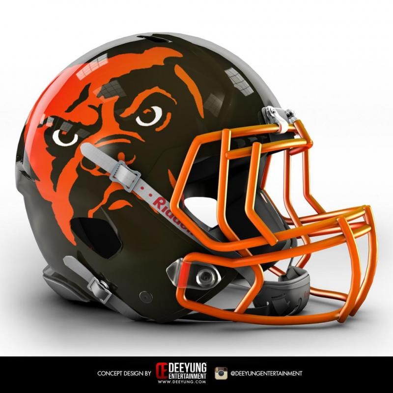
I sorta like the Browns possibly changing their mascot from the color brown to an angry looking black man.

I know. I was hoping it would be a turd. Just think of the marketing possibilities.

I like a lot of them as a one week type deal vs changing permanently.
Leave the helmets alone and get the hell off my lawn!
The white Packer helmet looks like it could be the J-E-T-S JETS JETS JETS
I think recent history has shown the Packers aren't changing anything, albeit for a throwback game or two. I'm fine with that. I am obsessed with Packer uniform history though. Check out this gold on gold combo from 1952.....
One of my favorite sites..... http://packersuniforms.blogspo...niform-timeline.html
I sorta like the Browns possibly changing their mascot from the color brown to an angry looking black man.
That logo just screams "I can't breathe!"
Just so everybody is clear, NONE OF THESE OPTIONS ARE BEING CONSIDERED OR DISCUSSED AS CHANGES TO THE BASE UNIFORM OR HELMET.
They are for an alternate to be worn once a year. I thought NFL said something about an alternate for Halloween only but can't find the link on the line.
I think recent history has shown the Packers aren't changing anything, albeit for a throwback game or two. I'm fine with that. I am obsessed with Packer uniform history though. Check out this gold on gold combo from 1952.....
One of my favorite sites..... http://packersuniforms.blogspo...niform-timeline.html
Kinda cool......

Just saw this on that site:
2010: New alternate uniform added, based on 1929 uniform, worn against the 49ers on December 5th: Navy jersey with navy numbers in large gold circle on chest, gold name and numbers on back. Canvas-colored pants, navy socks, brown helmet with gray facemask (to simulate leather helmet). The 1929 details have been updated to reflect current NFL uniform regulations: the circle, which was originally ~5 inches in diameter, has been enlarged, and the Reebok and NFL logos are retained in this uniform.
NFL regulations require each alternate to have a 5-season lifespan, so no other alternate can be introduced until 2015.
I noticed that the Pro Shop was discounting the Acme jerseys. Wondering if they are planning on using a different throw back jersey next year?
Good info on that from the same site. That Acme be done.
The white Packer helmet looks like it could be the J-E-T-S JETS JETS JETS
The first thing that hit me was an old Eagles design when they had green 'wings' on a flat white helmet. Ugh!
If the world were cars, I'd consider myself a 55 Chevy. I love classic things, and love it more when traditions don't change. (Translation: I'm a dinosaur.)
So, like Tdog and many others, I'm resistant to change and hold sacred the "gold" with a white "G" design, and don't want to see it change. Ever.
With that said, if changes were to be made, and I have to be dragged into the 21st century screaming and kicking, there are some workable designs. The second helmet posted by bvan certainly more palatable that the (way too) white design. Some of the uniform designs that DH13 posted have some possibilities. But I'd be more apt to choose a combination other than what they have paired together. Some of those helmets/uniforms won't work under any circumstances!
If the point to all these designs is for a throwback uniform, I don't understand why we don't copy or mimic designs from the Lombardi era primarily. I think it would be a nice 'tribute' to not only Vince, but to Starr, Kramer, Thurston, and Packers from that era (living and deceased). And it would have to be every bit as marketable as any other design.